Quick Turnaround Design Poll
Greetings everyone, I noticed I had more followers via itch than Twitter... which made me realize I needed to post a DevLog on the subject to potentially get more eyes on this poll, anyway... to the spiel!
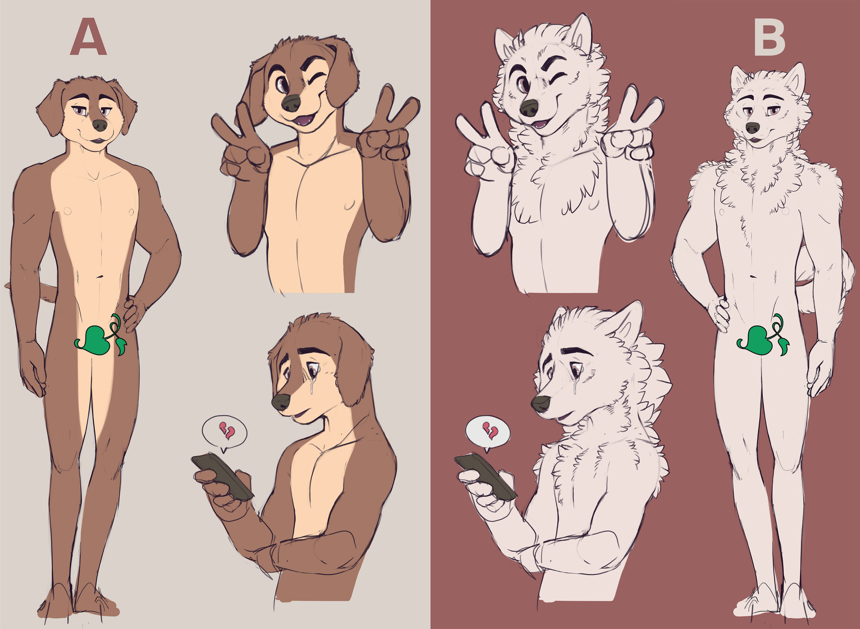
Greetings friends and apologies for the suddeness, but this is an important issue for which I require your assistance. It has come to my attention, that not everyone is fond of Mason our MC dog boy's design. Many of our survey feedback responses have been in relation to a dissatisfaction to his design. While I tend to disagree, I also can recognize that perspective exists, so we've been looking to tweak his design, or potentially even fully revamp him.
However, I don't want to do this and then find myself alienating any of you, because there's always a chance you've grown attached to Mason's current design.
Currently Mason is a Labrador Retriever, commonly mixed up for a beagle, weiner dog, and on one occasion an otter or tibetan mastiff. We're considering making him a Samoyed (and we'll tolerate mis-identifying him as a white husky) because there are several elements to the species that would make sense for Mason's character as well as role in the story.

So here are the two designs... I'm not indecisive on this matter, I just don't want to move forward with this idea only to find it was a terrible idea that others were not in favor of, so I thought I'd turn it towards all of you lovely people. So I suppose now I'll potentially know if Mason's design is indeed undesirable OR if it's just a very vocal minority.
Submit your votes here! (The poll will be closed in roughly 2 days as I imagine that will be plenty of time to have a clear determined result.) https://t.co/qGZgH9eAts?amp=1
Get Psychic Connections
Psychic Connections
A "mental" twist on a furry romance VN.
| Status | In development |
| Author | Rook |
| Genre | Visual Novel, Interactive Fiction |
| Tags | Adult, Bara, Dating Sim, Furry, Gay, LGBT, Romance, supernatural, Yaoi |
| Languages | English |
More posts
- Update on the Tale of an Unending HiatusMay 28, 2025
- What I hope to be the last hiatus Devlog...Jul 26, 2023
- So what's happening?Aug 02, 2022
- 2021 RetrospectiveDec 29, 2021
- Update on the Ongoing HiatusNov 30, 2021
- Release Response: 1 YR LaterSep 26, 2021
- Build 0.7 A late build finally arrives, with sad news to giveAug 15, 2021
- Build 0.6: I dare you to play this build!May 02, 2021
- Build 0.5: We're going on a trip!Apr 04, 2021
- 0.4.5 Update - New main menu, new backgroundsMar 02, 2021

Comments
Log in with itch.io to leave a comment.
Don't make himm scruffyyyy omgggg hard to differentiate wolf boyy and Masonnnn OwO
So what was the result of this poll?
Was going to make a delayed announcement for those that didn't check our Twitter in tandem with the update next week. The result was in favor of the original design.
We'll still be making minor tweaks to streamline the design across our images to raise consistency.
Happy to hear. I like the original design much better better, it's more unique and recognizable. Option B feels kinda generic to me.
Both designs are great, personally I like B more.
I love the original design better than new one. Fits more.
I'm not a Programmer so I don't know how things work or what to do to make it work. My thought is why not have it where Mason some how he forgets what he looks like and has to remember. Giving the one going through the story the choice in what he looks like.
I'm just that guy that sits home all day and just play games, watch memes/anime and read Visual Novels. I tend to accept changes and appreciate anything that comes my way because I know people want to create something with their heart and soul. If you fell the need to change Mason or any of the others for that matter, then I respect your judgement. We're all going through weird times so don't push your self too hard ok. (~`3`)~
i think it will be better to choose right now what he looks like because having the choice in the game mean working on all cjs twice in the future
yea I know, I just like having the thought. But what if B was another character only A or/and his new friends can see and hear. I might have been watching too many things with this concept.
Sounds like someone played repeat XD
Personally I think that a design like A really stands out. As most furry characters who aren't bara or hypersexualized tend to fall into one main category of just being a fluffy, very wolf-like design. I think going with a more unique look towards the main character is something I haven't seen doe in quite awhile. I have looked at other comments and one that stuck out to me, in which I agreed with, that the original design looks almost smooth-like compared to all the other much more fluffy designs. More so what I'm trying to say is that adding some form of texture to the ears or ends of appendages or joints might make the design feel more comfortable and less awkward when propped up against the other characters but that's just my opinion. In the end it falls down upon the development team on what they feel like they want, as a character that you write that you don't enjoy, might not get the best subconscious treatment.
For me B is really great but way to classic and i think that A actualy look technicaly cutter with his droppy ears. Small change for A could be great because for me he is kinda too perfect He need something to make him look less simple. So for me specie B is better but way too classic and design A look great and have personnality so... If you manage to make a real personnality for design B then i Will probably prefer him but as it stand design A is more original and look as great as B
Hey so... this comes from a person who hasn't played yet, but I think my opinion may interest you anyway for reasons that will be obvious.
I have noticed the game recently, and it caught my eye since I'm on the lookout for non-bara anthro games.
The plot and overall art are to my taste, for most part, but I'm going to be honest - I was a bit put off by how the main character looks. I don't mind the species at all - all the opposite, actually. Samoyeds looks a bit like huskies or wolves, and we have an overabundance of these, so a lab is perfectly fine on paper.
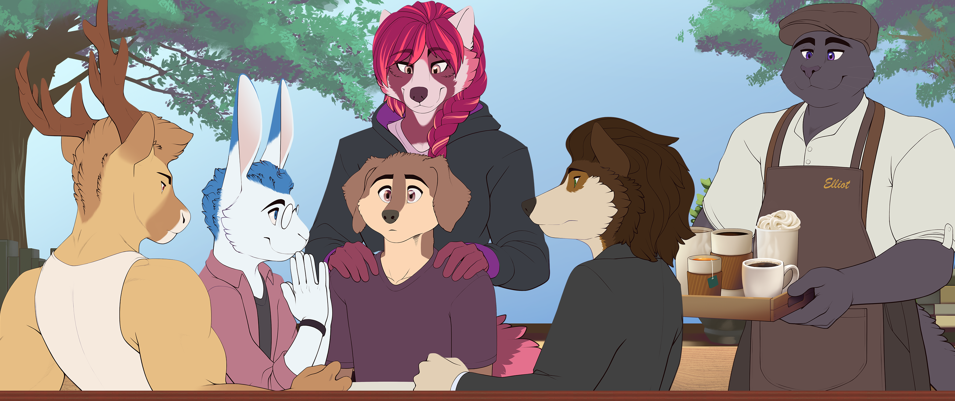
What I don't like is how he looks on that CG you use as a banner, which is the only instance of me seeing him, since I didn't play yet. He looks too... well... "round" and "smooth", for a lack of better words - a round and almost cartoony face that doesn't fit with the rest of the characters and no defined fur whatsoever. I hope it doesn't sound too harsh - I allow myself to criticize like that because I see how the other characters look more detailed and "refined". Just look at the other canines, and how their muzzle shapes are totally different, not to mention the cheeks and stuff...
But on your comparison reference pic - aka Design A - he looks stunning. He's gorgeous there, really. And I like him way more on said pic than on Design B. That's because he doesn't have such a round head, and you see fur defining. If you were to use that look for him, he'd be perfect.
Though I think it's worth mentionning I think having hair would look good on him. It's a bit strange that he doesn't have hair considering even the rabbit/hare character has, and both other canines have too. It would also make his head less round and smooth, obviously. But that's more of a personal opinion.
Either way, I'm going to play the demo soon!
I think Design A is the furry definition of bald
I have a hard time deciding if I think so or no, actually! For example, in the well known Hc Svnt Dracones universe, some people have hair in addition to their fur, others no, and it's at random, and well, not really considered bald. But in other universes with anthro character, you see that almost all have hair, so it's a bit weird if someone doesn't. I don't know the inner workings of this universe so eh... but I can't picture this character as bald, if I'm to be honest.
To be honest i didnt rlly mind as it isnt my story and i didnt create the characters but if u do change it would the new dog be white or is that just a design to show us the changes?
Like the original design better tbh. But if you were going to tweak Mason's design at all I think adding more fluff would make him look better. He looks too smooth in the game and I think adding some adjustments to maybe the upper chest/neck area, even small, would help.
I find A to be cute and original for the group. For me B blends into the group rather standing out on his own and we already got several floof characters in the group as well. I don't see too many Labs and rather too many Samoyeds. So stand out rather then blend in, but that's just my opinion.
That is a really good point and i fully agree aha
I like the old design better imo.
I honestly WOULDNT CHANGE THE MC ONE BIT!!! You've got to keep him like that!!
I really prefer design A. Not only is it far easier to continue with what has already been drawn but I love how each individual character has their own sort of colour palette that really compliments their personality. I feel like not only will the white fur be too similar to Quinn but the fur design on B is quite reminiscent of Aiden too. Might just be me though! Wouldn't mind either design but A's design and palette really just compliments the group dynamic, if that makes any sense at all?
It's hard, i love them both, A have those ears that are just the cutest, and he have a really good shoulder that I liked, but B have the Floofs and is so huggable, I would be happy by either of them, so just follow what you think it's best for you and the story
I like both designs, but B is a floofy good boi so he kinda wins out in the end. The character is adorkable in the best way possible regardless of breed. <3
oh, i could see him running around without a jacket more if he were a samoyed. i figured he was a lab, though, and i don't have any problem with what Mason is, but... i'll vote.
Hm, I love samoyeds but original Mason already looks good and decent. He really has that MC-look while Mason B kinda looks like another love interest.
Tbf, both designs are great and all but I would be more irked with the major design change rather than the design itself. 🥴
But hey, you decided to ask for our opinion instead of just say "hey, some people asked to change the design so I did", major kudos for that!
tbh both of them are cute !